Some Seattleites think the city's flag is boring. Do you?

Add Axios as your preferred source to
see more of our stories on Google.
If you didn't know Seattle has a flag, you're not alone.
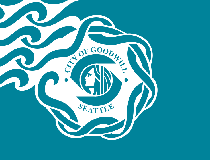
Adopted in 1990 as the city was set to host the Goodwill Games, the city's turquoise and white flag — featuring a profile of Chief Sealth surrounded by swirling currents and the words "City of Goodwill" and "Seattle" — never stood out.
Why it matters: Seattle deserves better, flag experts say.
What we're hearing: Once you learn to see poorly designed flags, you see them everywhere, so "imagine my horror when I looked up Seattle's flag," wrote Seattle engineer Adam Wuerl in a blog post on a proposed redesign.
State of play: Seattle's flag breaks two of five key flag rules: It uses letters and it's too complex, Ted Kaye, a spokesperson for the North American Vexillological Association (NAVA) and compiler of "Good Flag, Bad Flag," once told the Seattle Times.
- Flags should be simple enough for a child to draw and instantly recognizable at a distance, he said.
- "A great city deserves a great flag, and Seattle's doesn't do the city justice," Kaye said.
Yes, and: Former City Councilmember Jean Godden wrote back in 2019 that Seattle's flag was mocked when she carried it through a banquet hall in Vancouver years earlier as a delegate to the Association of Washington Cities annual convention.
Tell us: What do you think of Seattle's flag? Is it time for a new one? Do you have a design in mind? And are you willing to take the fight to City Hall?
- Email us at [email protected].