Atlanta's flag design lacks inspiration, vexillologists say

Add Axios as your preferred source to
see more of our stories on Google.
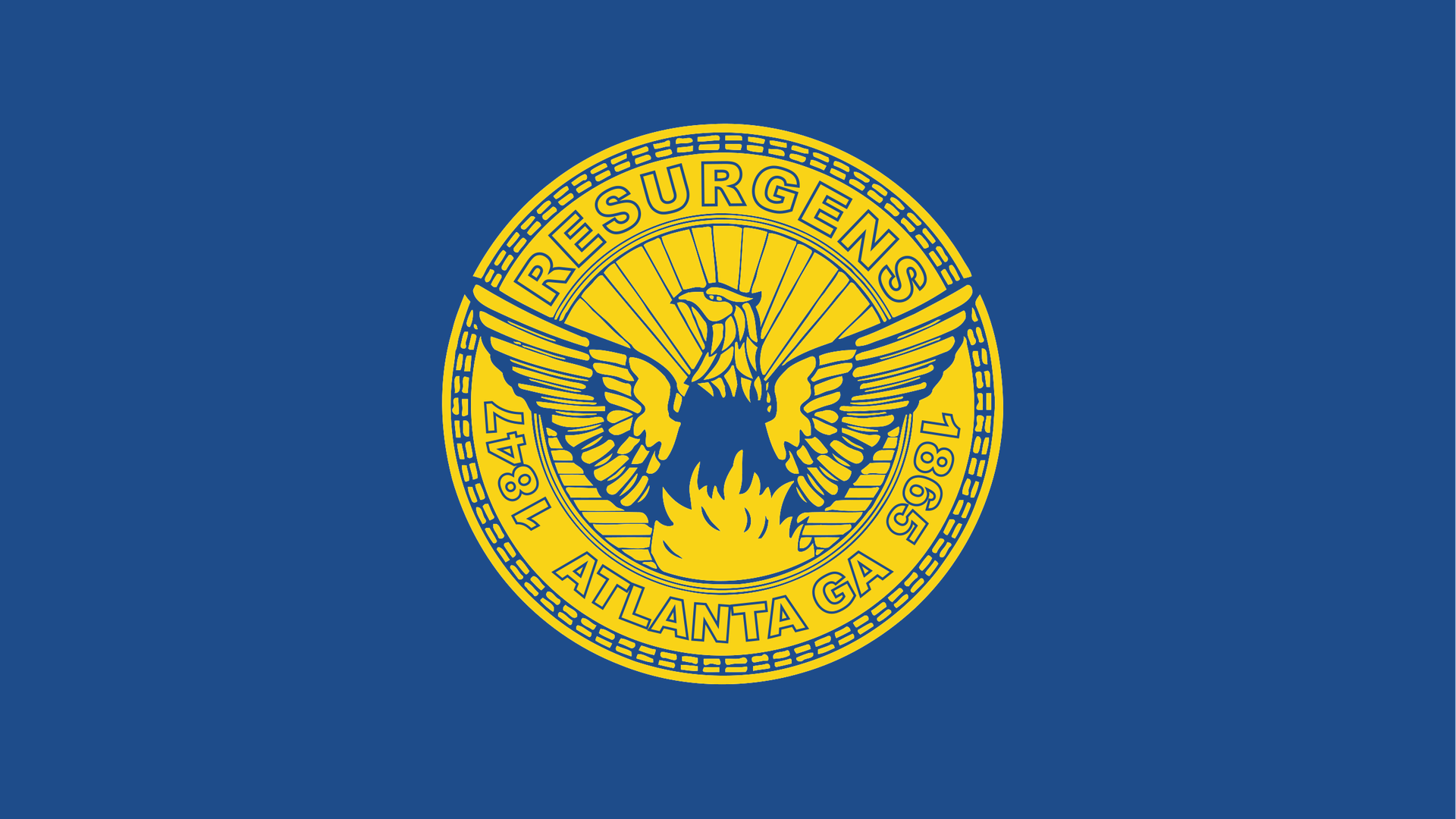
Image: Wikipedia
Flags, like religion and politics, are best not debated at the dinner table. But this is a news site, not a dinner table, so let's do this.
Driving the news: It's Flag Day, and we're wondering: Does Atlanta's flag need a makeover?
Why it matters: Flags should be points of pride for residents. But you're more likely to see an Atlanta United banner than an Atlanta flag on porches around town.
Details: Atlanta's flag is an example of what vexillologists derisively refer to as an "S.O.B." — "seal on a bedsheet" — and rated near the bottom of the North American Vexillology Association's 2004 survey of city flags.
- A city seal represents the government and is best viewed from one side, while still and close up, Ted Kaye, who compiled NAVA's "Good Flag, Bad Flag" book, told Axios. Flags should represent the people.
What they're saying: When it comes to flag design, keep it simple, Kaye said.
- A well-designed flag "has meaningful symbolism. It has few colors. It has no lettering or seals, and it's distinctive."
- A good rule of thumb: If a child can't draw your flag, it's probably too complex. For inspiration, check out Chicago and Washington, D.C.
The bottom line: "People say that a great city deserves a great flag," Kaye said. "If you think Atlanta is a great city, then you should work to have a great flag like that."
Catch up quick: Roughly seven years ago, a local vexillophile named Matt Potts called for changing the city flag and solicited submissions. Kaye said some of the submissions hit the mark — Dogwood and New Atlanta, among them.
- Potts, who also runs the associated Instagram account, says he is still collecting submissions and contacts for the initiative.
Of note: A City Hall spokesperson told Axios that Mayor Andre Dickens had no thoughts on changing the city flag.