Axios Homepage
  • Sections
  • Axios Pro
  • Events
  • About Axios
  • Sign up
  1. Photo illustration of masked people in a line with an EKG-style line through the middle and grid in the backgroundGraphing the pandemic
  2. Moving chart showing COVID-19 daily cases over one year as the axes adjust upward1. 2020: The year the y-axis broke
  3. Image describing 2. Pandemic was devastating for America's working women2. Pandemic was devastating for America's working women
  4. Image describing 3. Entrepreneurs look for luck in pandemic lockdown3. Entrepreneurs look for luck in pandemic lockdown
  5. Image describing 4. Americans are behind on rent4. Americans are behind on rent
  6. Image describing 5. The transformation of eating during the pandemic5. The transformation of eating during the pandemic
  7. Image describing 6. This flu season is mild — and that could have a long-term impact6. This flu season is mild — and that could have a long-term impact
  8. Image describing 7. Sluggish spending on activities is hampering the recovery7. Sluggish spending on activities is hampering the recovery
  9. Image describing 8. Kids have been glued to screens during pandemic8. Kids have been glued to screens during pandemic
  10. Image describing 9. The year that throttled travel9. The year that throttled travel
  11. 2019 Kurdish New Year and 2020 in Wuhan. 10. In photos: The pandemic's stark impact
  12. Image describing Get more Deep Dives in your inboxGet more Deep Dives in your inbox

Presented by Facebook

Graphing the pandemic

  • Mike Allen
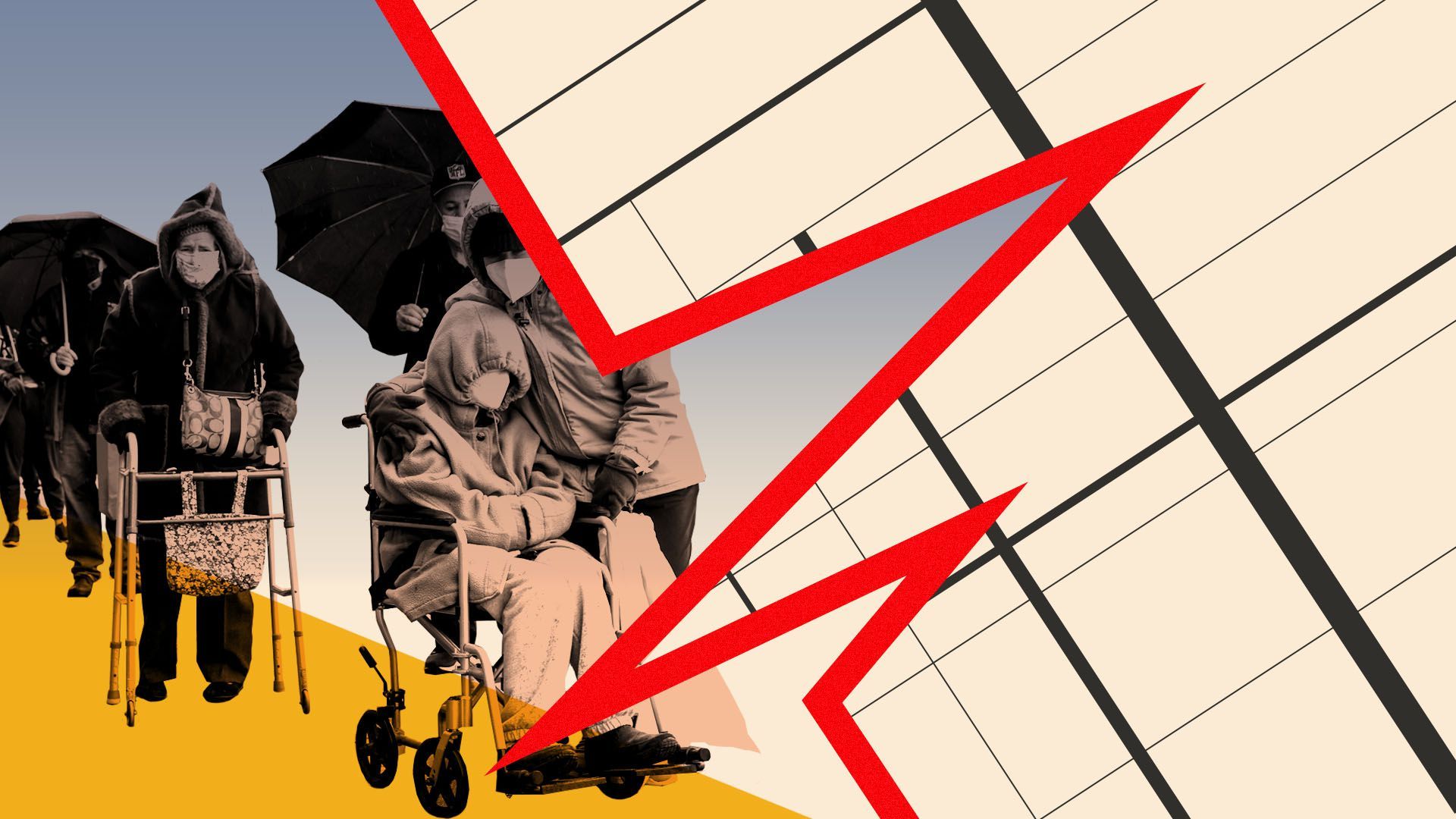
2020 was literally off the charts. Data journalists saw changes that typically take months instead happening in weeks — numbers that will be breaking the y-axis for years to come.
Apr 5, 2021 - Economy
Photo illustration of masked people in a line with an EKG-style line through the middle and grid in the backgroundPhoto illustration of masked people in a line with an EKG-style line through the middle and grid in the background
Tap to start