Broadcasters adjust to MLB's pitch clock

Add Axios as your preferred source to
see more of our stories on Google.
/2023/05/03/1683156581323.gif?w=3840)
Illustration: Brendan Lynch/Axios
Major League Baseball's new pitch clock has forced big leaguers to make adjustments. It's demanded change from broadcasters, too, as they try to weave the clock into their coverage.
State of play: During spring training, networks tested out a variety of ways to visualize the pitch clock. Now, one month into the season, they've all mostly settled on their own unique solution.
- Some keep the pitch clock visible at all times, while others only show the timer when it's about to run out. Some clocks turn a different color with 10 seconds left, while others don't.
- It's all about striking a balance between (a) helping the viewer "feel" the pitch clock and (b) not reminding them of it so frequently that it takes away from the joy of baseball.
Between the lines: Numerous pitch clock graphics have been used this season, from local broadcasts on regional sports networks to national broadcasts on ESPN, Fox, Apple, TBS and Peacock. Every network, it seems, has a slightly different take on what works best.
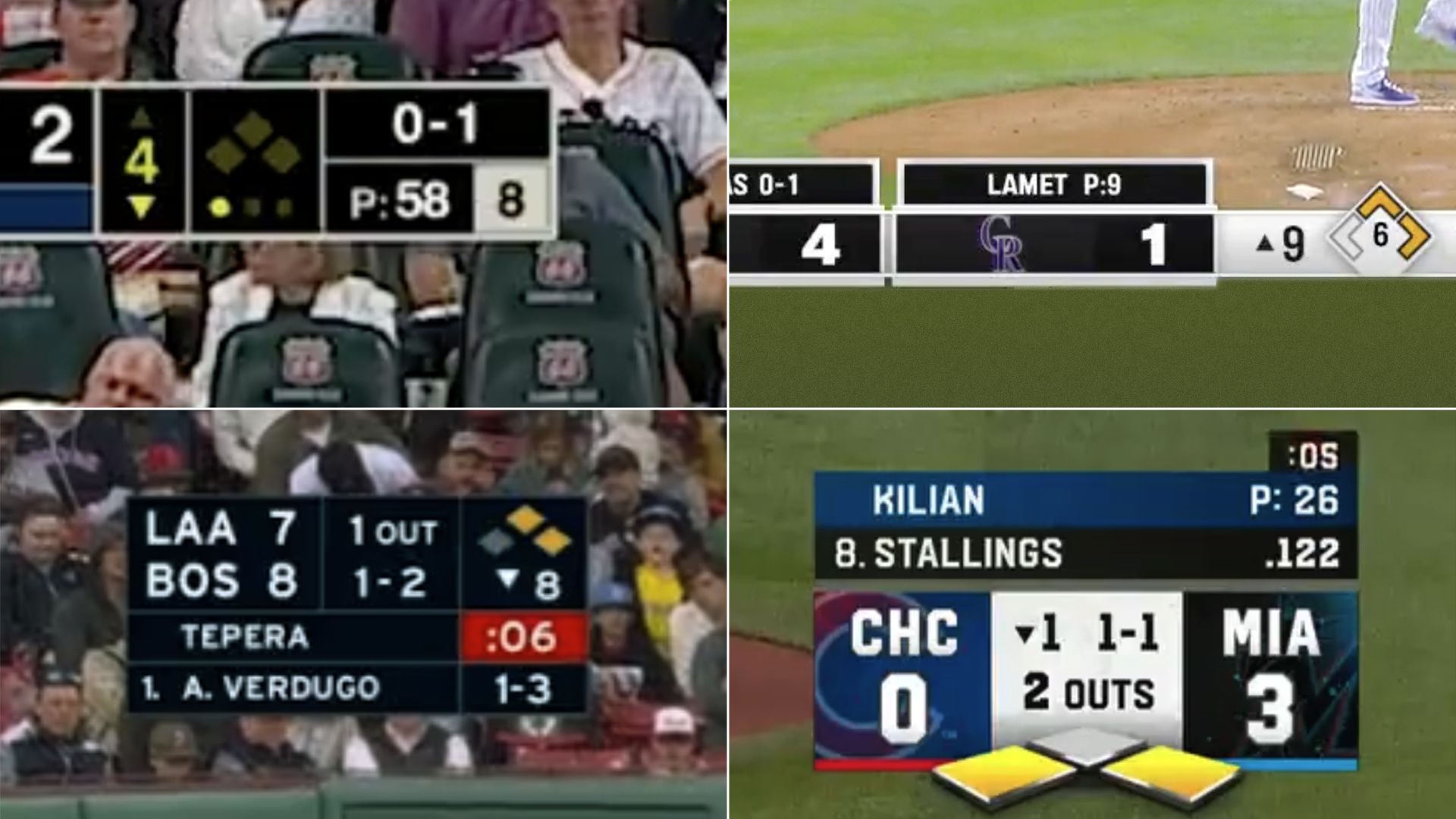
A few examples from above:
- ESPN (top left): In spring training, ESPN's pitch clock graphic popped out of the right side of the score bug. Now, it has its own dedicated spot next to the pitch count and is visible for much of the game.
- Bally Sports (top right): The clock is located neatly inside the diamond, which shows how many players are on base and how many outs there are.
- Fox (bottom right): The clock pops out of the score bug when it nears zero, likely drawing more attention than the more static examples above. Fox has also used a virtual clock that pops up on the mound.
- NESN (bottom left): The clock is above the pitch count, and a red background appears once it hits 10 seconds. This catches the viewer's eye, while also being very on-brand for NESN's team, the Boston Red Sox.
The backdrop: In 1994, Fox introduced a score bug as part of its inaugural season of NFL coverage. Variety criticized the so-called "FoxBox" as an "annoying see-through clock and score graphic," but it soon became a ubiquitous feature of all sports broadcasts.
- Networks have routinely upgraded their score bugs, transforming what were once fairly simple scoreboards into robust information hubs (think: in-game stats, timeouts, pitch count, shot/play clock, etc).
- Fitting everything into such a confined space is "like a visual puzzle," ESPN vice president of production Phil Orlins tells me. And while the addition of the pitch clock didn't require a full redesign, "we had to move the furniture around," he adds.
What they're saying: "I don't think taking [the clock] in and out over and over again makes it less intrusive to the viewer," says Orlins. "I would rather find a comfortable way to let it stay on the screen the vast majority of the time, and let viewers choose when they want to be served rather than producers or directors telling them, 'Now is the time to read some information.'"
- This sounds fundamentally different from Fox's approach. Their pop-out and on-mound clocks feel much more like "alerts" designed to remind viewers — frequently — about the ticking timer behind the scenes.
- Something to watch: Could pitch clock graphics eventually be sponsored? It seems likely. The NBA has Tissot for the shot clock, and Rolex is the "official timekeeper" of a bunch of events.
The bottom line: Ultimately, every MLB broadcast partner is trying to usher in baseball's new normal as seamlessly as possible. And quite frankly, they all seem to be succeeding. "I've already stopped noticing the pitch clock," a friend told me this week. Honestly, same.
