Map: A look at world population density in 3D
Add Axios as your preferred source to
see more of our stories on Google.

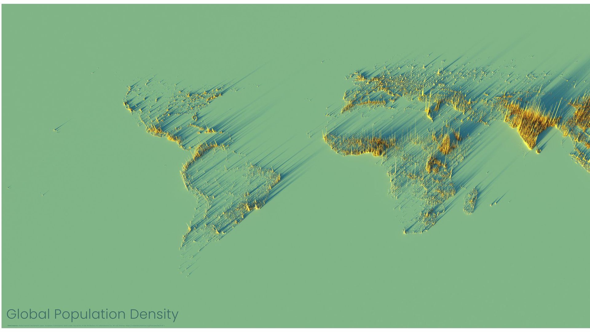
This fascinating map is made by Alasdair Rae of Sheffield, England, a former professor of urban studies who is the founder of Automatic Knowledge. It shows world population density in 3D.
Details: "No land is shown on the map, only the locations where people actually live. ... The higher the spike, the more people live in an area. Where there are no spikes, there are no people (e.g. you can clearly identify ... the Sahara Desert)."
- The major world population concentrations are immediately obvious — particularly China, India and Indonesia.
- "Yet it is often also possible to pick out even quite small towns and cities, such as those in the south of New Zealand, or northern Russia."
How it works: Rae says that he uses "data from the EU's GHSL dataset, software is Aerialod by @ephtracy and render time for the big image was about 6 hours."
- Rae explains that the light-and-shadow effect lets you identify some isolated population centers, including ones in Hawaii and central Australia.
- And he reminds us of the old saying: "Where there is water, there is life."
Go deeper: "How to make a 3D population density render for any country in the world." ... More maps.
