Why the new tech redesigns all look the same

Add Axios as your preferred source to
see more of our stories on Google.
Axios visuals
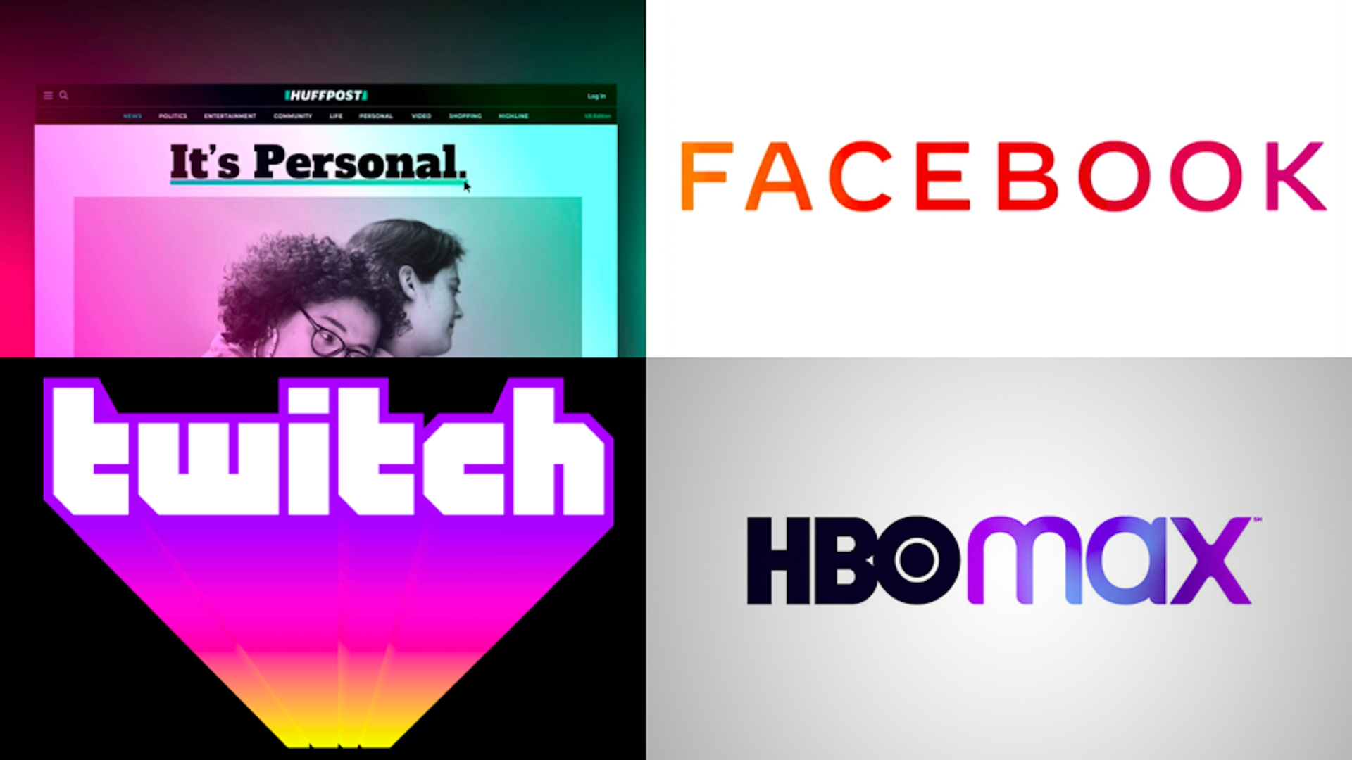
Gradients, or rainbow designs, are the hottest new trend to hit tech and media.
The big picture: According to design experts, the trend seems to be a rebuke to the simplistic design trend that captured the early 2000's, when web logo simplicity was more functional.
Driving the news: Facebook unveiled its new logo Monday, showing off a gradient of rainbow colors in the text.
- HuffPost also unveiled an updated design with gradient colors on Monday.
- HBO Max has gradients in its new logo, revealed last week.
- Twitch added gradients to its redesigned logo in September.
- Apple may be revisiting its famous 1977 gradient logo, reports have suggested. That era for Apple was a stark difference from the Steve Jobs era that continuing through until today has embraced monochromatic, minimalist design.
Flashback: The trend seems to have kicked off in 2016, when Instagram famously unveiled its updated gradient camera logo.
- At the time of Instagram's rebrand, acclaimed Michael Bierut said on his design podcast that the gradient may create a sense of nostalgia — a throw-back to the early days of the internet when tools like Microsoft Paint empowered users to use very harsh design tools, like gradation filters.
The big picture: According to design experts, the trend seems to be a rebuke to the simplistic design trend that captured the early 2000's, when web logo simplicity was more functional.
- "I believe that some brands moved to flat designs this century to improve their digital presences," says Ashleigh Axios, former Obama White House creative director. "Today, however, technology has improved enough that even more complex color gradients can be made with code and load in our products without such extreme implications."
- "I think in the case of giant brands, the thinking may be that the only thing more powerful than owning a single color — like IBM's blue, or Coke's red — is to own the entire spectrum. In the digital age, a million colors cost the same as one, so why not?" Bierut emails.
The bottom line: "More recent introduction of saturated, multi-colored gradients is likely a reaction to the feedback about boring logo treatments," says Ashleigh Axios.
