The 2020 campaign gets colorful

Add Axios as your preferred source to
see more of our stories on Google.


2020 campaign websites, color palettes and logos are more colorful and dynamic than ever before — a reflection of the endless opportunities of campaigning in a digital era and the pressure on candidates to stand out and to stand up for issues they care about.
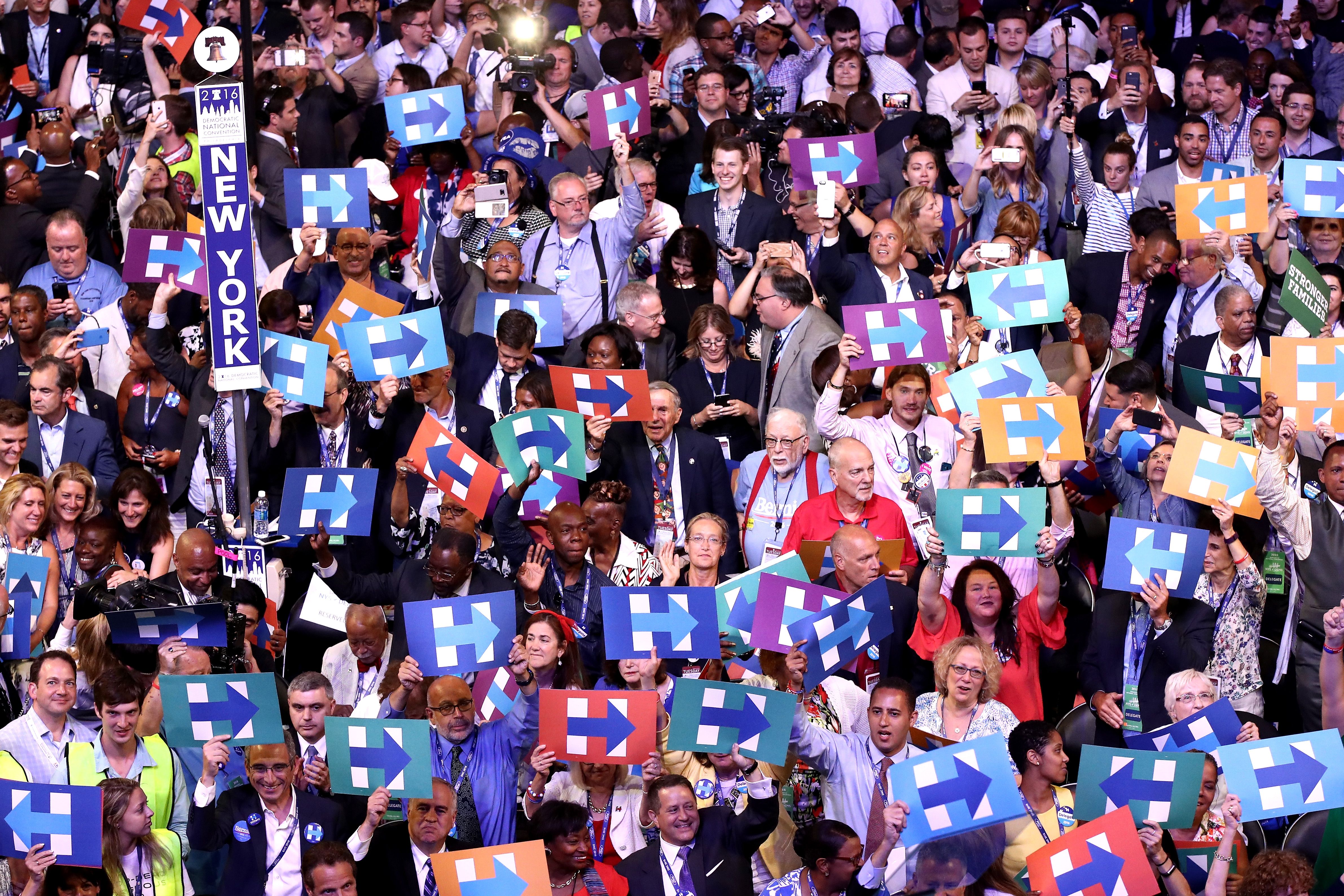
Why it matters: "In the past, the national colors of red, white and blue have always been safe," says acclaimed graphic designer Michael Bierut, who created the infamous "H" logo for Hillary Clinton's 2016 presidential campaign. "This cycle’s candidates must sense that to fit in with a field of 20+ contenders is to be invisible. So the campaigns are taking risks."
The big picture: The transition towards more dynamic campaign creative makes sense for the digital world, where candidates have to fuel dozens of variations of digital ads and posts, on top of real-world signage. But it's also an important departure from tradition.
- "I believe we're finally beginning to enter an era where candidates aren't feeling as compelled to amplify their sense of credibility and suitability for such a high office by matching their look to their understanding of the office's historical look," says Ashleigh Axios, former Obama White House Creative Director.
- "Instead, they're making space in their visual identities for themselves, owning and signifying that the White House is only as good as the people who occupy it."
Breaking down the 2020 trends:
Candidates are embracing colors that also embody their policy principles. Candidates with priorities around climate change, like Jay Inslee and Amy Klobuchar, are using greens. Inslee's campaign logo features a shape that mimics a globe with green and blue hues.
- Kirsten Gillibrand and Marianne Williamson, who support issues like funding planned parenthood and equal pay for women, are including bright pinks in their design schemes.
Younger candidates are taking bold approaches. Beto O'Rouke has chosen to avoid all colors, opting solely for an authoritative black and white logo. Pete Buttigeieg's color scheme is much more modern, featuring yellow, blue, orange and tan hues.
- "Because so much is communicated online and in digital form, it’s possible to make changes instantaneously, and to integrate animation and dynamism into the message," says Bierut.
- "This may make younger candidates like Pete and Beto more open to experimenting with non-traditional colors. In contrast, Joe and Bernie have the most traditional red-white-and-blue/flag motif logos; to them and their teams, this is simply what campaign graphics are have always looked like."
Even though many of the campaigns have introduced new color schemes into their electoral palettes, most haven't ditched red, white and blue entirely.
- Kamala Harris, for example, has revealed that her red and yellow campaign aesthetic is a nod back to Shirley Chisholm, the first black woman elected to Congress and the first woman and African American to seek the presidential nomination.
- Ashleigh Axios notes that "pairing this color with a version of the traditional red, white, and blue sends that message of inclusion and not erasure. It communicates to me that it's not the goal of the candidate to change America by moving away from the red, white, and blue entirely, but instead to better showcase of what and who America is really comprised."
The blue factor: To no surprise, different variations of the color blue definitely stand out amongst the 2020 field, despite a wave of new color choices.
- "Blue is definitely a favorable color in digital," says Brian Donahue, CEO and Founder of CRAFT, a Washington-based creative agency that has deep experience in the political space. "You see with it with Facebook, Twitter and a lot of popular platforms. Blue is a pleasing and common color to the eye on digital screens."
- "Dark blue in particular has historically added a sense of credibility and sober acknowledgement to campaigns in addition to tying the brands back to the colors of the American flag," says Ashleigh Axios.
- Yes, but: "One concern for picking such a daring and bold color choice is when we look out over the blue sea of democratic supporters, perception of support for some candidates will be in the number of green or pink signs," says Chris Delia, Group Creative Director of Code and Theory, a design agency.
Be smart: The trend isn't completely new. Jimmy Carter famously chose green and white as his primary campaign colors to reinforce his background as a peanut farmer to voters.
- Bierut notes that while Clinton's primary color scheme was blue and white, the campaign designed a logo that could work with any color scheme, making it more dynamic.
The bottom line: "There’s a trend this cycle to be less formal and more contemporary," says David Placek, the Founder and President of Lexicon Branding. "I think the thing to watch out there is how informal one risks being. If you cross the line and appear too friendly and informal in your logo and branding, you could risk appearing like you are not going to deliver on professionalism."
