A sports logo expert has designs on D.C.'s teams

Add Axios as your preferred source to
see more of our stories on Google.
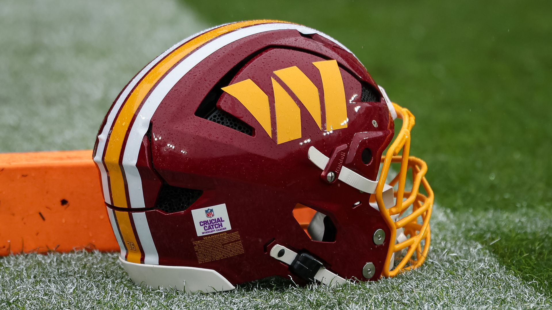
The Commanders could change their primary logo as soon as next season. Photo: Scott Taetsch/Getty Images
Asked which D.C. franchise he'd most like to redesign, Todd Radom didn't hesitate: "Wizards! What a challenge!"
- Radom isn't some amateur posting mockups to social media; he's a veteran designer who helped create the Nationals' original look.
- And he's got thoughts on how Washington's teams could improve their logos, uniforms and overall brands.
Why it matters: "Sports fans are the ultimate brand loyalists," Radom told Axios. "We tattoo our logos on our bodies."
- But designing a logo isn't simply about making a handsome image. It needs to work on everything from a giant video board to a tiny social media avatar — and still play when embroidered on a cap.
Driving the news: The Commanders are considering another logo change.
- Washington's NFL franchise might make its spear-and-W logo its primary mark in 2027, according to reporting this month by Zach Cohen, subsequently confirmed by other outlets.
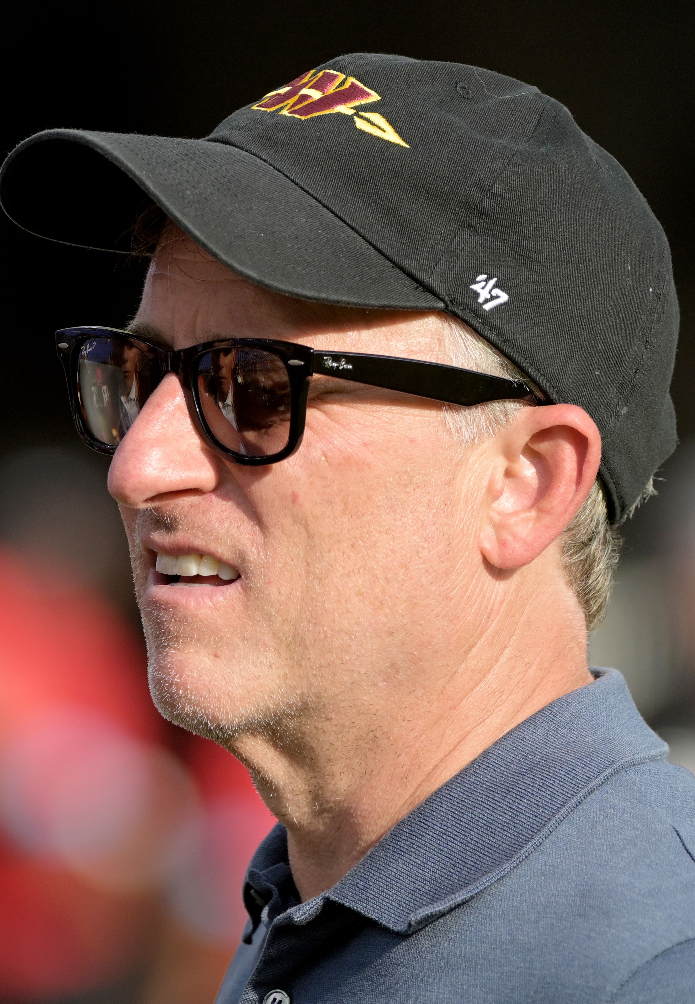
- "I like the spear," owner Josh Harris told reporters while donning a hat with it.
Meanwhile: The Wizards — to the delight of their fans — are eyeing a uniform refresh for the 2027-28 season, Monumental executives told The Athletic's Josh Robbins.
- A new logo could follow.
- The rebrand would go beyond new uniforms and jerseys, the execs said.
The big picture: D.C.'s sports identity leans patriotic: red, white and blue.
- Radom points to Pittsburgh, where the Steelers, Penguins and Pirates share black and gold — the city's official colors — and have a united sports culture.
- Washington's embrace of its U.S. capital status seems, at times, more forced.
The exception: The Commanders, whose burgundy and gold should remain untouched, Radom says.
- He's less enthusiastic about their logos. He finds the W "generic" and questions whether the spear fits the Commanders' name.
- "When you're creating brand confusion, you're not really doing a good job," he said.
Yes, but: Winning can make even an ordinary logo iconic.
- Radom points to the Green Bay Packers' G, which isn't inspiring on its own. Its association with championships, however, makes it instantly recognizable.
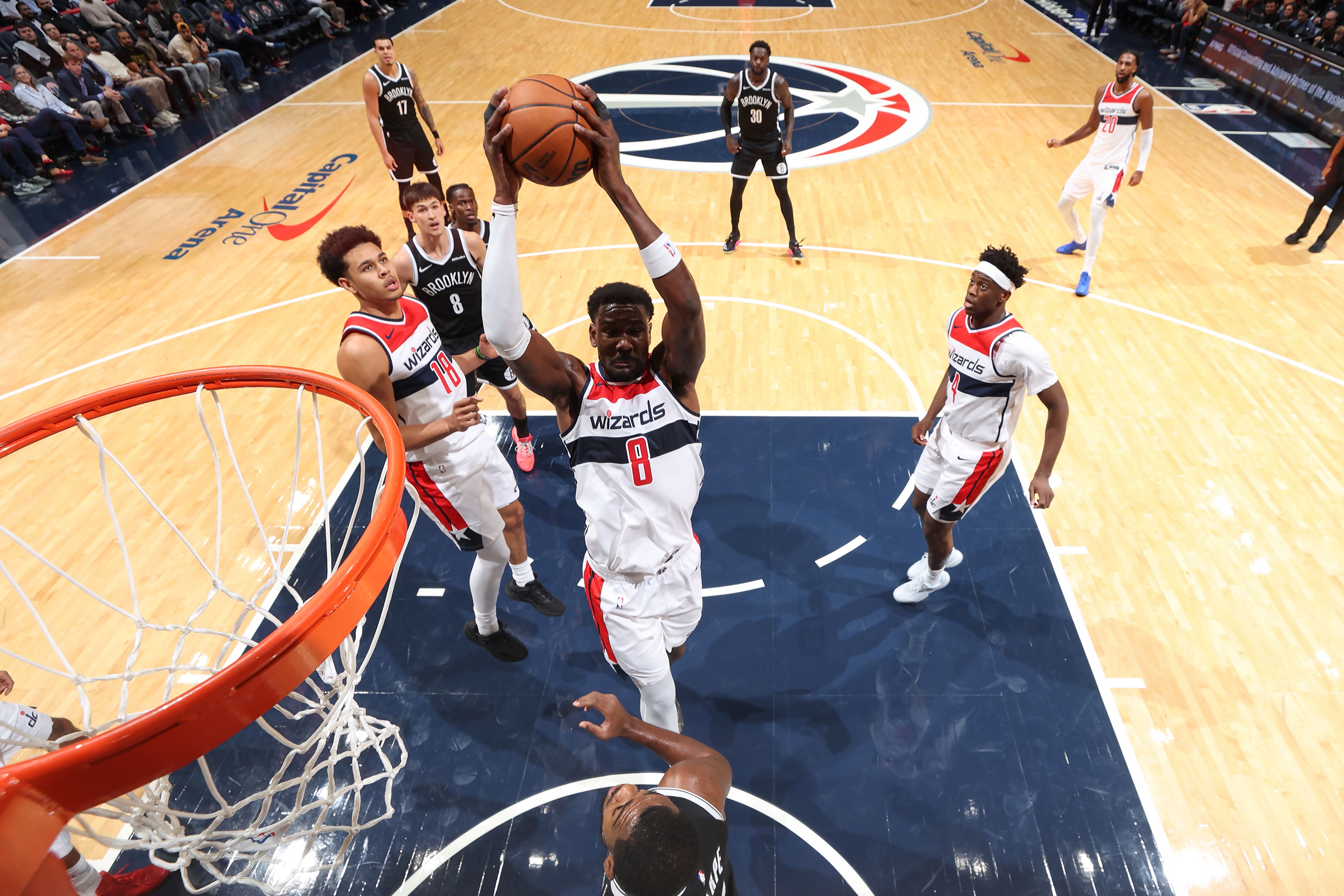
As for the Wizards: Radom believes their red, white and blue look, carried over from the Bullets, has run its course.
- "There's equity attached to it, but it's not great equity," he said.
- Radom's advice? "Start from scratch." Sort of like the roster!
- He wouldn't change the name, though.
The intrigue: Winning could alter how fans perceive the Wizards' look. And with the team trying to turn a corner on the court, this could be the right time to establish a new identity.
Around town: Radom has thoughts on Washington's other franchises, too.
- Capitals: Their jerseys look stuck in the mid-2000s, but their overall identity works — thanks in part to Alex Ovechkin's longevity and the accompanying victories.
- Nationals: Radom designed their original identity in just two weeks in 2004. He thinks today's look mostly works, though the Curly W on their caps clashes with their jerseys' blocky font.
The bottom line: Radom likes nostalgia but worries teams have become too dependent on it, stifling innovation.
- He compared retro branding to "a big heaping bowl of mashed potatoes."
- "It's not necessarily good for us, but it's going to taste good."