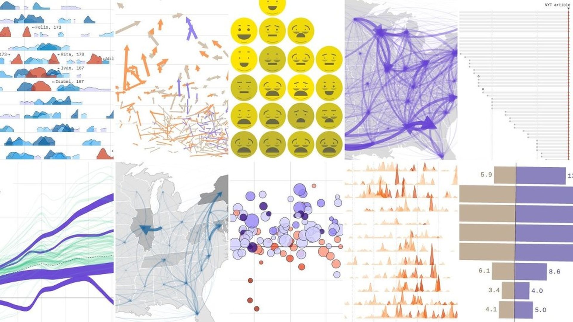
Axios has made made hundreds of data visualizations this year, covering everything from hurricane season to how the economy is changing. Here's a countdown of our favorite data pieces from 2017.
Go deeper: Check out our special stream featuring all of these pieces. Many of our favorite visualizations are interactive and/or animated.
Thanks for checking out our work! Make sure to follow @AxiosVisuals on Twitter to keep tabs on all the cool stuff we'll be making in 2018.