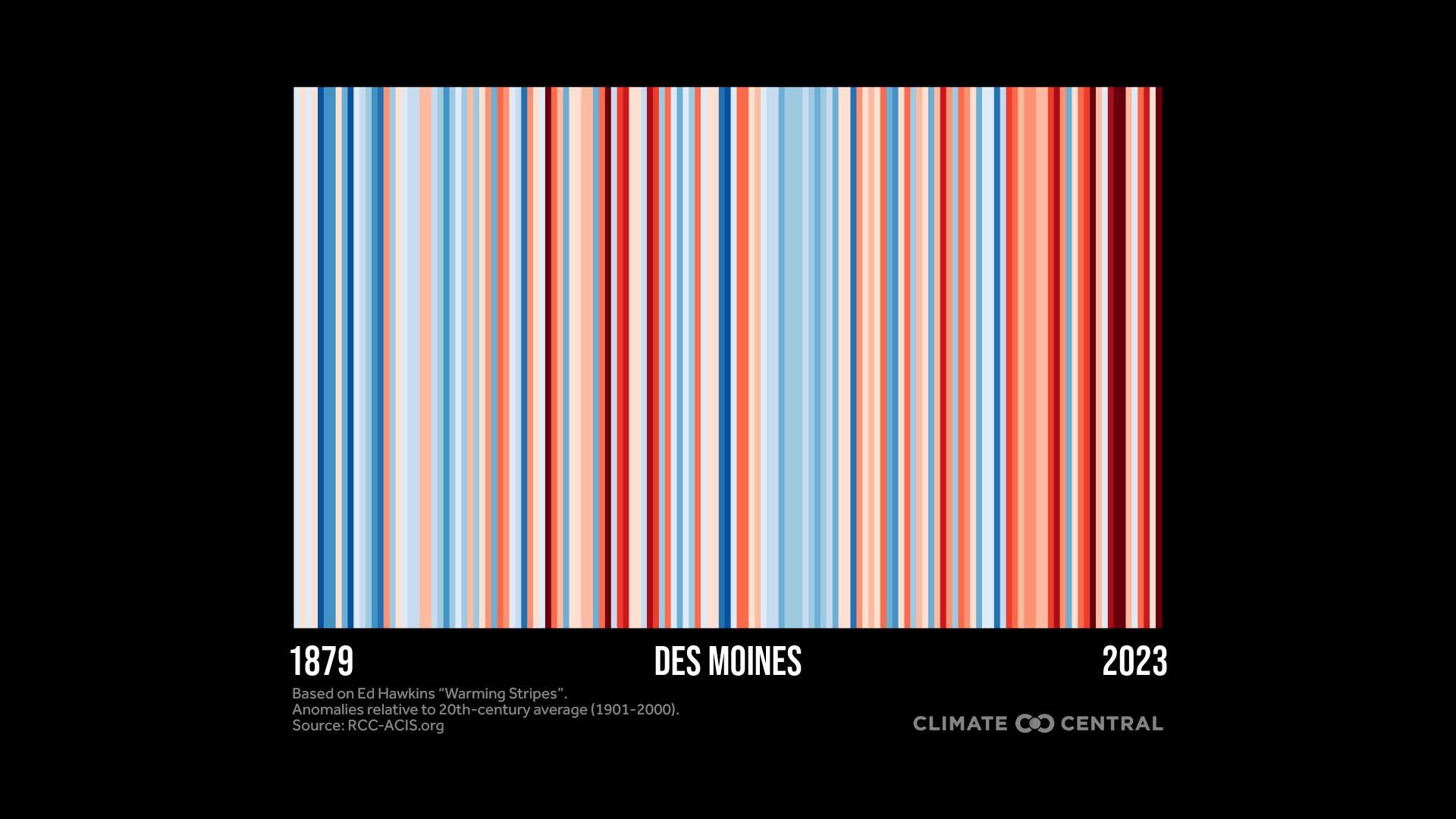
Des Moines' annual temperatures from 1875 to 2023, relative to the 1901 to 2000 average, with colder years in blue and warmer years in red. Data source: RCC-ACIS.org
This temperature graph for Des Moines shows the scale of climate trends in the last century; each red stripe represents a year of above-average temperatures and each blue one a year that was colder than average.
Driving the news: The graphic, produced by Climate Central, a nonprofit focused on climate change, aims to generate urgency on addressing climate change.